

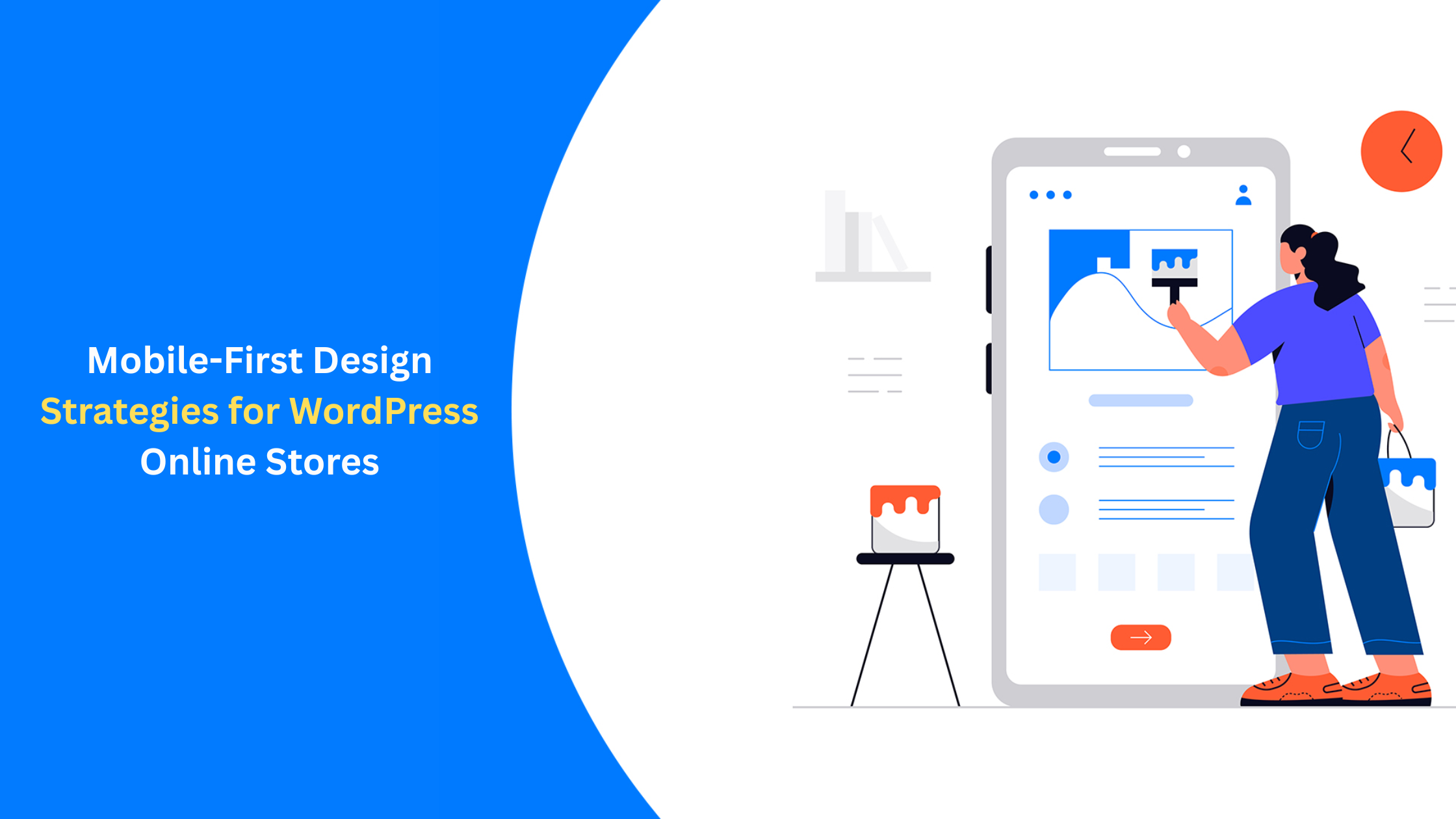
Mobile-First Design Strategies for WordPress Online Stores
The rise of mobile commerce has changed the way customers check, compare, and buy online. Currently, more than half of all eCommerce sales are done through mobile devices, which means that a mobile-first design is no longer a matter of choice but a must-have base for any successful WordPress online store.
If your website is created with mobile users in mind right from the start, you offer a more comfortable shopping experience, quicker loading times, and higher conversion rates. Companies that want to improve their results and increase customer satisfaction need to understand mobile-first strategies.
Why Mobile-First Matters for WordPress eCommerce
Mobile-first design does the opposite of traditional responsive design. Instead of adjusting a desktop layout for smaller screens, it first designs for mobile and then scales up for tablets and desktops. As a result, it has cleaner layouts, better usability, and highly efficient performance. Besides that, WordPress stores that use WooCommerce and follow mobile-first principles will also be optimally compatible with plugins, checkout flows, and product display modules, thus sales and user engagement will be increased.
Prioritising Clear, Touch-Friendly Navigation
The most difficult thing for mobile screens is their limited space. Users must be able to quickly and easily find categories, filters, and product pages without getting lost. By using sticky menus, collapsible navigation, and locating thumb-friendly buttons, users can achieve the kind of browsing that is flowing and non-stop. This method lowers the friction and thus greatly decreases the bounce rates that are caused by cluttered designs. By getting professional web design services from a company like Designpluz, businesses will be able to produce user-friendly mobile menus and navigation patterns, which not only improve usability but also help in branding consistency.
Speed Matters More on Mobile
One of the main contributors to lowering the search rankings, according to Google's Core Web Vitals, is slow mobile speed. The major causes of a slow WordPress eCommerce website include unoptimised images, messy code, the lack of server-side caching, and heavy themes. Therefore, mobile users are very impatient to the point that they demand pages to be loaded within a few seconds. Any longer than that and the users will go elsewhere, taking with them the sales the company had. It is true that some plugins can do the job, but the biggest and most effective changes should come from the strategic decisions of the developers. Essentially, businesses that are in search of a long-term eCommerce website development solution may place their trust in Designpluz to perform all the trimming they need, both for the frontend and backend, in order to achieve maximum speed.
Designing for Thumb Zones & One-Handed Shopping
Consumers usually do their browsing while they are moving, thus the mobile UI should be designed in a way that it can be operated using just one hand. Hence, indispensable components such as "Add to Cart", filters, CTAs, and navigation links must be located within the zones where the thumb can easily reach them. This ergonomic method not only serves the purpose of user comfort but also cuts checkout drop-off rates. By implementing mobile-first design, users will find that every single interaction they have is supported, whether it is scrolling through a card layout or viewing a product placement.
Optimising Product Pages for Mobile Users
Product pages should be able to load fast, have high-quality images, and provide the most important information straight away. The users should not need to zoom in or scroll endlessly to get a grasp of what the product is. Some of the mobile-first product page strategies are:
- Hero product images with swipe galleries
- Cleanly spaced bullet points for key features
- Prominent pricing and CTA placement
- Sticky "Add to Cart" buttons
These changes have a direct positive effect on conversion rates and user trust.
Streamlined, Mobile-Friendly Checkout Experiences
Long checkouts are among the top reasons for the mobile device cart abandonment problem. WordPress mobile-first stores should implement the use of completions that are simple, having auto-fill fields, and digital wallets (Apple Pay, Google Pay) alongside minimal input requirements. On receiving help from the WordPress specialists at Designpluz, businesses will be able to revamp checkout journeys into a smooth and easy process, thus lessening the obstacles and promoting quicker purchases.
Testing Across Multiple Devices
Different mobile screens have different sizes. To make sure a WordPress store works perfectly on Android, iOS, and any other screen sizes, tests need to be done. Some of the tools one can use for testing are Google Lighthouse, BrowserStack, and WordPress device previews. These tools pinpoint and allow for the early correction of the visual and functional differences that may be present in the store.
Final Thoughts
With the mobile-first design as the basis, a WordPress online store is prepared to meet the user's needs in the best way possible. This is the safest and most satisfying long-term bet when it comes to mobile shopping, which is gradually becoming the main channel in the eCommerce world. Every step, from speeding up to making the interaction thumb-friendly, contributes to the overall goal of providing the customers with the best experience possible. At Designpluz, our expert team ensures your WordPress eCommerce store is not only visually impressive but strategically engineered for high performance across all devices.
© 2026 Scenario.press - libera espressione
 Portuguese
Portuguese
 English
 Arabic
 French
 Spanish
 Deutsch
 Turkish
 Dutch
Dutch
 Italiano
 Russian
 Romaian
 Portuguese (Brazil)
 Greek
Greek