

Color Psychology in Interior Design: How Shades Shape Your Mood
When you step into a room, what’s the first thing that catches your attention? For most people, it’s the color. Whether it’s the calm of a pastel blue bedroom, the energy of a bright yellow kitchen, or the sophistication of a charcoal-grey office, colors instantly affect how you feel. This isn’t just coincidence—it’s color psychology at work.
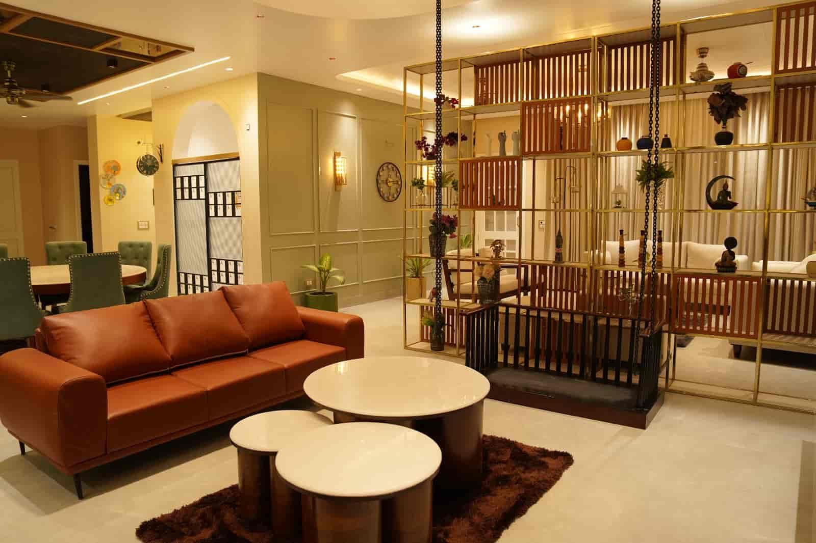
In interior design, colors do far more than make a room look pretty. They influence our emotions, behaviors, and even our productivity. Understanding how different shades impact mood can help you make better choices when decorating your home or office. At Design Crew Studio, we believe that the right color palette can transform an ordinary space into one that feels personal, inspiring, and deeply connected to your lifestyle.
Let’s dive into how shades shape mood and why they play such a vital role in interior design.
Why Color Psychology Matters in Interiors
Every color evokes certain emotions. Some shades are calming, while others are energizing or even overwhelming if not used carefully. For instance:
-
Blue can make a space feel tranquil.
-
Red stimulates energy and passion.
-
Yellow inspires positivity and warmth.
When used correctly, colors can improve sleep, enhance focus, or create a more welcoming atmosphere. This is why professional designers pay so much attention to color palettes—it’s not just about aesthetics, but also about how people experience the space.
The Emotional Impact of Different Colors
Here’s a closer look at how specific colors influence mood in interior spaces:
1. Blue – Calm & Peaceful
Blue is often associated with calmness, stability, and trust. It works beautifully in bedrooms, bathrooms, or study areas where you want to feel relaxed. Lighter blues can open up a space, while darker tones add depth and sophistication.
2. Green – Balance & Freshness
Green represents harmony and renewal. It connects us to nature and promotes relaxation. That’s why it’s often recommended for living rooms, kitchens, or home offices. Adding plants alongside green walls enhances the effect even more.
3. Yellow – Energy & Positivity
Yellow radiates warmth and cheerfulness. It’s a color that brings light into darker spaces and lifts your mood instantly. Great for kitchens and dining areas, yellow encourages social interaction. However, too much bright yellow can be overwhelming, so it’s best used in moderation.
4. Red – Passion & Excitement
Red is bold, powerful, and attention-grabbing. It can spark energy and conversation, making it ideal for living rooms or dining spaces. But because red is intense, it should be balanced with neutral shades to avoid overstimulation.
5. White – Purity & Simplicity
White symbolizes cleanliness, openness, and simplicity. It’s widely used to make small rooms feel bigger and brighter. Many modern homes use white as a base color, adding pops of brighter shades for personality.
6. Grey – Elegance & Sophistication
Grey is versatile and timeless. Depending on the shade, it can feel cozy or sleek. It’s often paired with bold colors to balance vibrancy while keeping the space elegant.
7. Purple – Luxury & Creativity
Historically associated with royalty, purple adds richness and creativity to interiors. Soft lavender is calming, while deep purple conveys drama and luxury.
8. Orange – Warmth & Vitality
Orange combines the energy of red and the cheer of yellow. It creates warmth and vitality, making it perfect for family rooms or workout areas.
9. Black – Bold & Dramatic
Black adds depth, sophistication, and contrast. While it shouldn’t dominate a space, accents of black can ground lighter tones and make a bold statement.
How to Choose the Right Color for Your Space
Selecting the right shade depends on the purpose of the room and your personal preferences. Here are some quick guidelines:
-
Bedrooms: Stick to calming shades like blue, soft green, or lavender.
-
Living Rooms: Warm, inviting tones like beige, soft yellow, or muted greens work well.
-
Home Offices: Use colors that boost focus, such as green, light blue, or neutral tones with bright accents.
-
Kitchens: Yellows, whites, and light greys keep the space lively and open.
-
Bathrooms: Whites, soft blues, and aqua shades create a refreshing and clean feel.
At Design Crew Studio, we often recommend blending neutral base shades with small pops of color through furniture, décor, or artwork. This approach keeps the space versatile and easy to update over time.
The Role of Lighting in Color Psychology
Colors don’t exist in isolation—lighting plays a huge role in how they’re perceived. A shade that looks soothing under natural daylight may feel dull under artificial lighting. That’s why it’s important to test paint samples at different times of the day before finalizing.
For example, north-facing rooms may make colors appear cooler, so warmer tones are often better suited. Meanwhile, rooms with abundant sunlight can handle deeper and richer colors.
Affordable Color Solutions for Every Home
Designing a home with color psychology in mind doesn’t always mean spending a fortune. Even small, budget-friendly changes—like repainting a single accent wall, adding colorful cushions, or changing curtains—can have a big impact. Many homeowners now look for affordable interior designers in Noida who can deliver stylish, functional, and mood-enhancing spaces without exceeding budgets.
That’s where Design Crew Studio stands out. Known among the most affordable interior designers in Noida, our team focuses on maximizing results with smart, cost-effective design solutions. Whether it’s choosing the right paint finish, recommending budget-friendly décor, or customizing furniture in line with your needs, we make sure every design decision enhances your lifestyle.
The best part is that you don’t have to sacrifice quality or creativity. Our designers ensure that even the simplest upgrades are thoughtfully executed to reflect your personality and uplift your mood. This is why many clients consider us among the most trusted and affordable interior designers in Noida.
Final Thoughts
Colors are more than just decoration—they shape emotions, influence energy, and set the tone of your daily life. Understanding color psychology in interior design can help you create spaces that not only look beautiful but also feel right.
Whether you want a peaceful retreat, a lively social hub, or a focused workspace, the right shades can make all the difference. And if you’re unsure where to start, working with experts like Design Crew Studio ensures you get the perfect balance of style, comfort, and psychology-driven design.
Your home is your canvas—choose colors wisely, and let them tell your story.